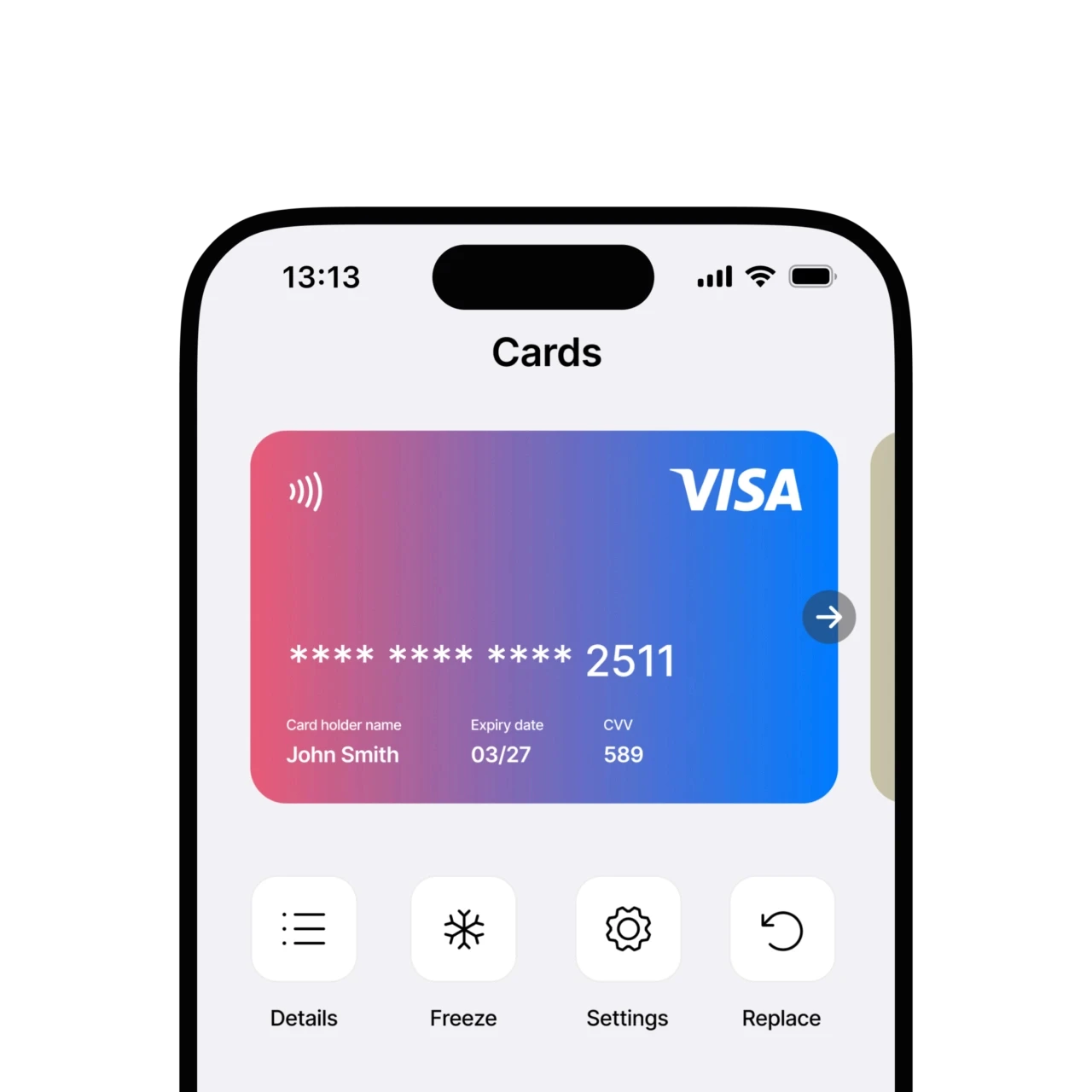
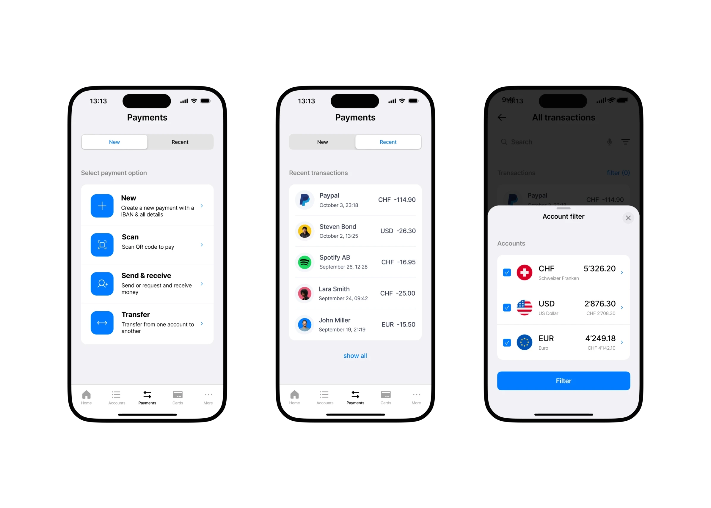
Mobile Banking.
A minimalistic banking app design focusing on simplicity.
Client.
Concept
Tools.
Figma
Year.
2022 - open
Role.
UI Designer
App Concept
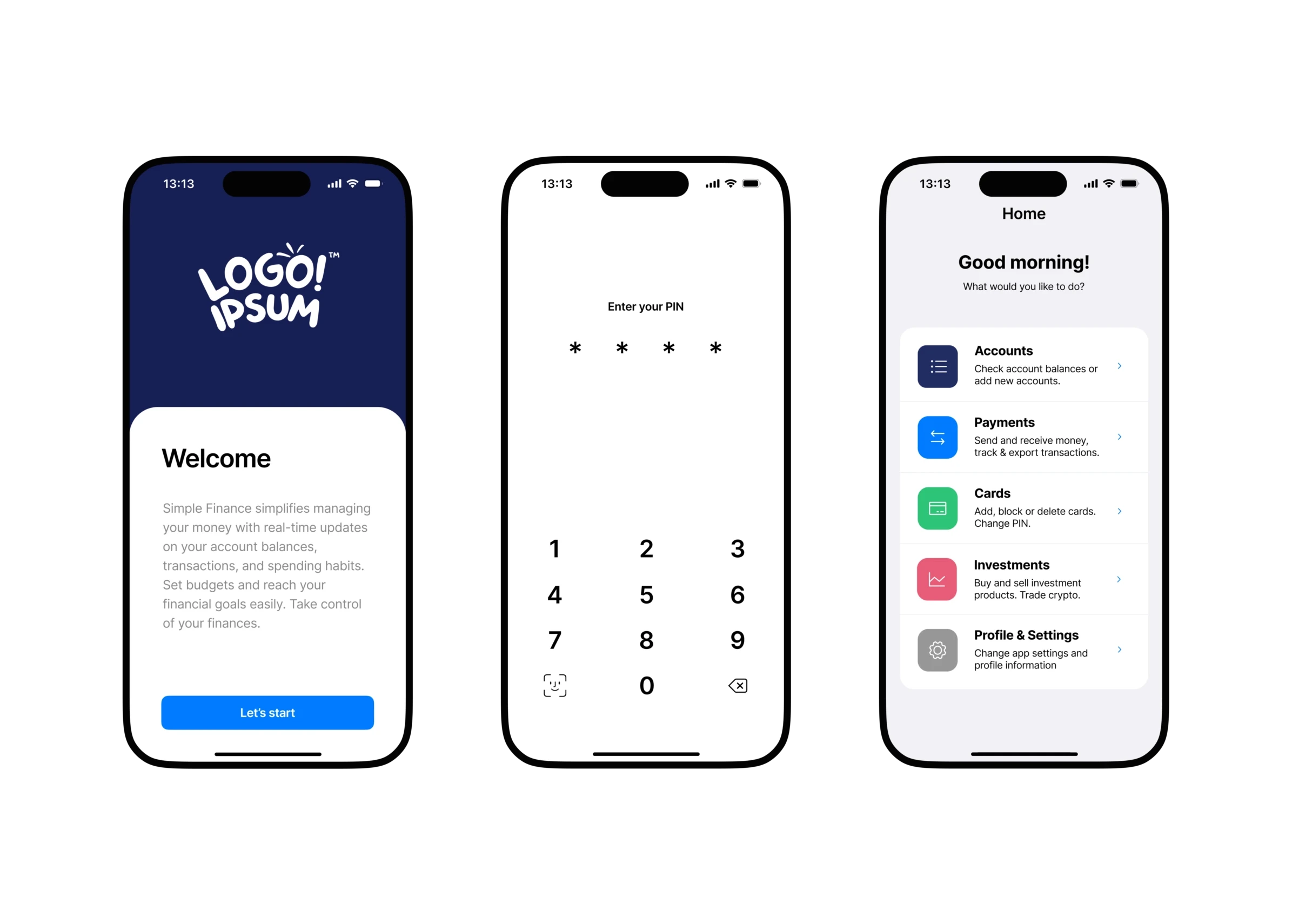
The primary goal was to minimize all aspects to the utmost, retaining only the essential and necessary components to accomplish the users tasks. No elaborate diversions, no wild connections directing to other categories. Maintain cleanliness, maintain simplicity. Indeed, one might also call it unexciting.
Keep it simple
Minimal animation, fewer choices. Solely essential components included. Everything else of the screen remains whitespace.
Key principles
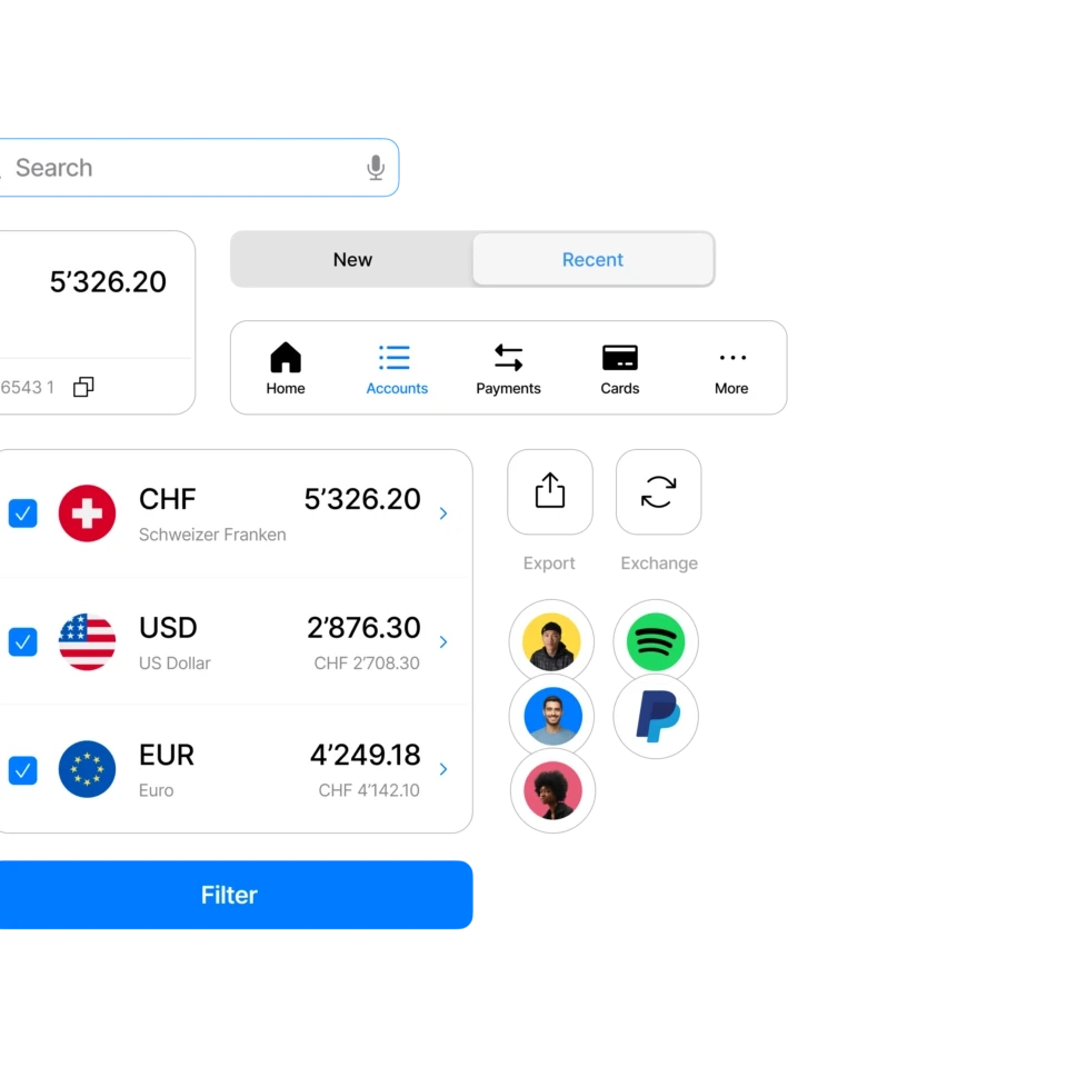
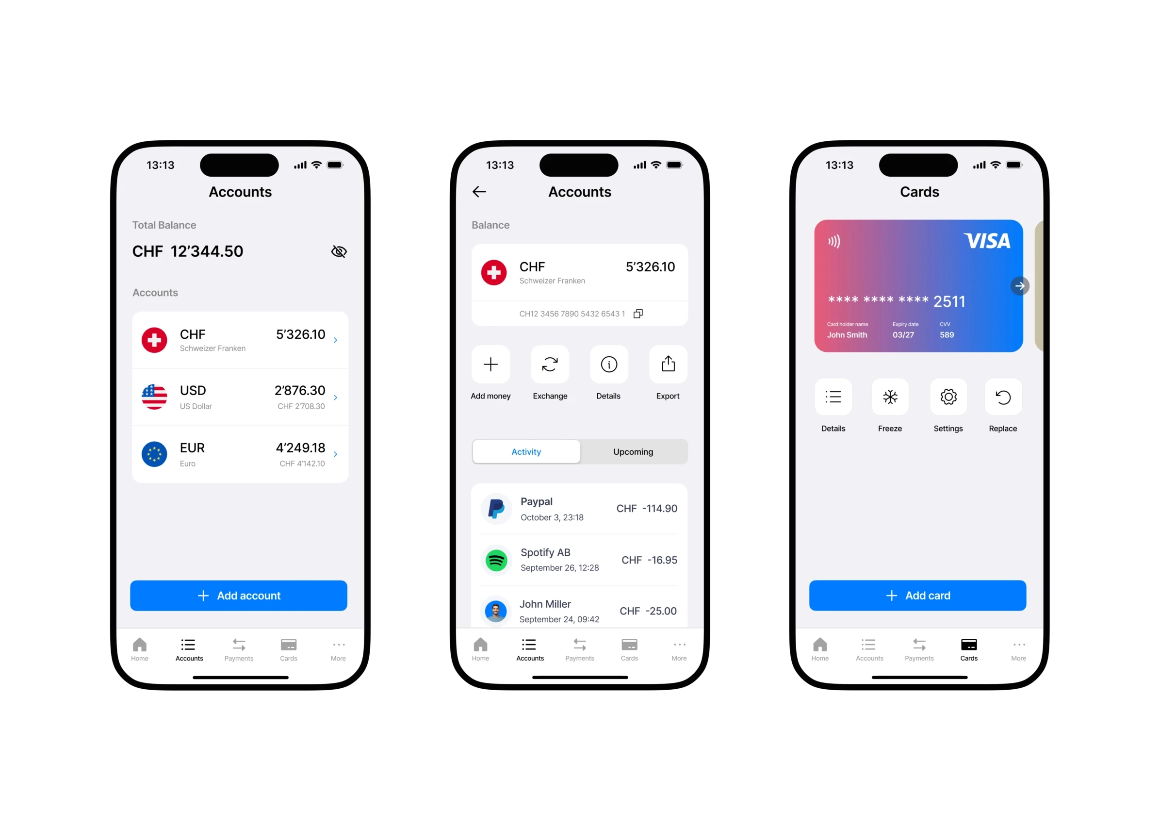
Navigation: Always visible tabbar
Labels. Icons. Contacts. No guessing
Filter: reduce overload
No 'hidden' features. WYSIWYG
Limited configuration options
The project is work in progress. Additional screens, details and ideas will be added over time. See below the progress so far.
Figures and names are fictitious and for illustrative purposes only.
